Appearance
The canvas
The canvas is where you build. You drop components onto it, wire them together, and read the results back — all on one infinite, grid-aligned surface. This page covers moving around the canvas and the two ways to place a component: from the palette and by double-clicking to search.
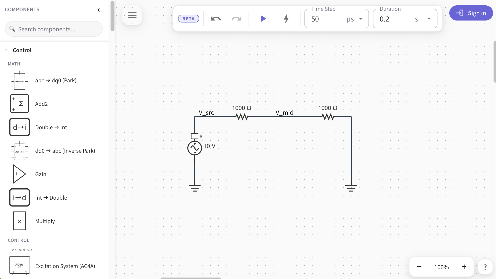
The editor at a glance
When the app loads you have four surfaces:
- The component palette — a searchable, categorized list of every component, docked on the left. Open by default; collapse it with the ‹ button in its header and reopen it with the › handle that appears at the canvas edge.
- The canvas — the dotted-grid work area in the center. It scrolls and zooms, and grows in every direction as your circuit expands.
- The simulation toolbar — floats at the top with Run, load flow, the Time Step / Duration fields, and the menu. See Running a simulation.
- The scope panel — slides up from the bottom once a run has data to plot. See Scope panel.
Moving around the canvas
The canvas is effectively infinite — it auto-grows as you place components near an edge, so you never run out of room.
Pan (move the view):
- Scroll with the mouse wheel or trackpad to move up / down; hold
Shiftfor horizontal on most mice. - Middle-mouse drag to pan freely.
- One finger drag on a touch device pans the canvas.
Zoom (25%–400%, in 25% steps):
- Use the zoom control at the bottom-right: the − / + buttons step the zoom, and the center field is a live percentage you can click and type into (e.g. type
150and pressEnter). - Hold
Ctrl(⌘on macOS) and scroll to zoom in on the point under the cursor. - Pinch with two fingers on a touch device.
Everything snaps to the grid
Components and wire endpoints snap to a 16-pixel grid. That's what keeps wires drawing as clean straight lines between neighboring parts — you don't have to nudge anything into alignment by hand.
Placing components from the palette
The palette is your browse-and-drop rail. Type in the Search components… box to filter by name or description; matches expand every section so nothing hides behind a collapsed group. Clear the box to return to the full, categorized list.
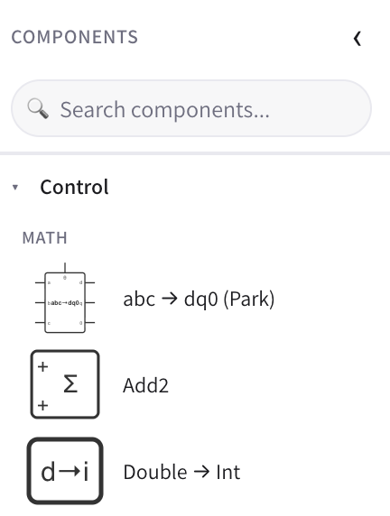
Components are grouped by domain — Control, Electrical, Measurement, and Configuration — and then by category within each. Every row shows a thumbnail of the component's symbol and its name; hover for a one-line description. Components that need a higher plan appear grayed out (see Plans & limits).
There are two ways to place a component with a mouse or pen:
- Tap to arm. Click a row once. A semi-transparent ghost of the component follows your cursor. Move to where you want it and click on empty canvas to drop it.
- Press and drag. Press on a row and drag past a few pixels: the ghost is picked up immediately and dropped when you release the button over the canvas.
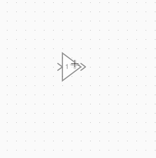
While a ghost is in flight:
- Press
Rto rotate it 90° clockwise before dropping. - Press
Esc(or click back on the palette) to cancel without placing anything.
Placing on touch
On a touch device, long-press a palette row for about a third of a second to pick it up, then drag onto the canvas and lift your finger to drop. A quick tap is intentionally ignored so you can scroll the palette list without accidentally dropping a component behind it.
The Bus tool
The palette also has a synthetic Bus entry. Arming it lets you draw a bus segment on the canvas instead of dropping a fixed-size symbol — handy for building a shared electrical node other components tap into.
Placing components by double-click search
When you already know what you want, you don't have to travel to the palette and back. Double-click any empty spot on the canvas to open a spotlight-style Add component search right where you clicked.
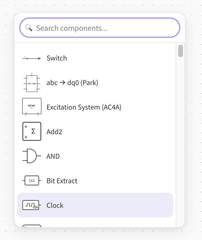
- Double-click empty canvas (or double-tap on a touch device). The search box opens at that point, already focused.
- Start typing to filter — the list ranks the closest matches first.
- Pick a component:
- Click a row, or
- use
↑/↓to move the highlight and pressEnterto place the top / highlighted match.
- The component drops exactly where you double-clicked — no second click needed.
Press Esc or click outside the popup to dismiss it without placing anything.
Palette vs. quick-add
They share the same catalog and the same search, so use whichever is faster in the moment: the palette to browse and discover, the double-click search to type-and-place without leaving your spot on the canvas.
Selecting, moving, and rotating
Once a component is on the canvas:
- Click it to select; drag to move it (it re-snaps to the grid on release, and connected wires re-route automatically).
- Press
Rto rotate the selected component 90° clockwise. - Press
Delete/Backspaceto remove it. - Double-click a component to open its properties dialog and edit parameters.
See also
- Running a simulation — set the time step and duration, then press Run.
- Wire routing — how connections are drawn and edited.
- Observables — name the signals you want to record and plot.
- Your first circuit — a start-to-finish walkthrough.